Creator, Product Designer & Developer | Summer 2016
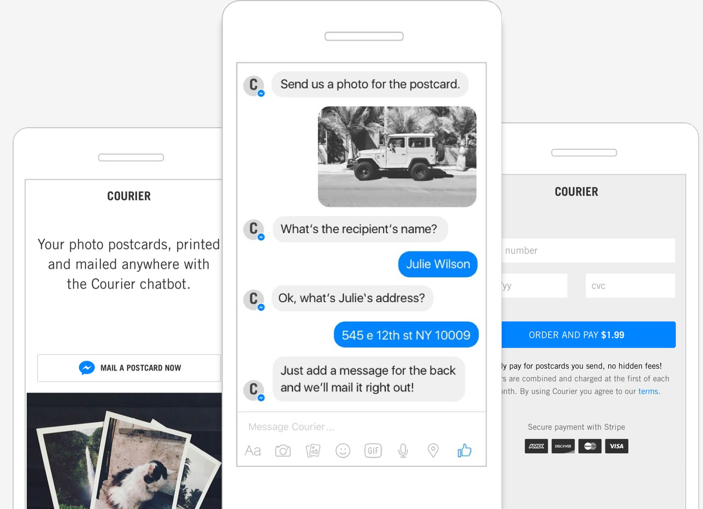
Courier is a Facebook chatbot that turns photos into printed postcards and mails them anywhere. Visit site.
Courier is a Facebook chatbot that turns photos into printed postcards and mails them anywhere. Visit site.
 ”
”
I designed and built this product from the ground up because mailing postcards is a pain. I decided to attack the problem using the bot paradigm because it seemed like a natural fit for the simple flow the service would require. Select a pic, add recipient info, and confirm payment. The beauty is there’s no app to download, user account creation is automatic, and messaging users is more powerful than email.
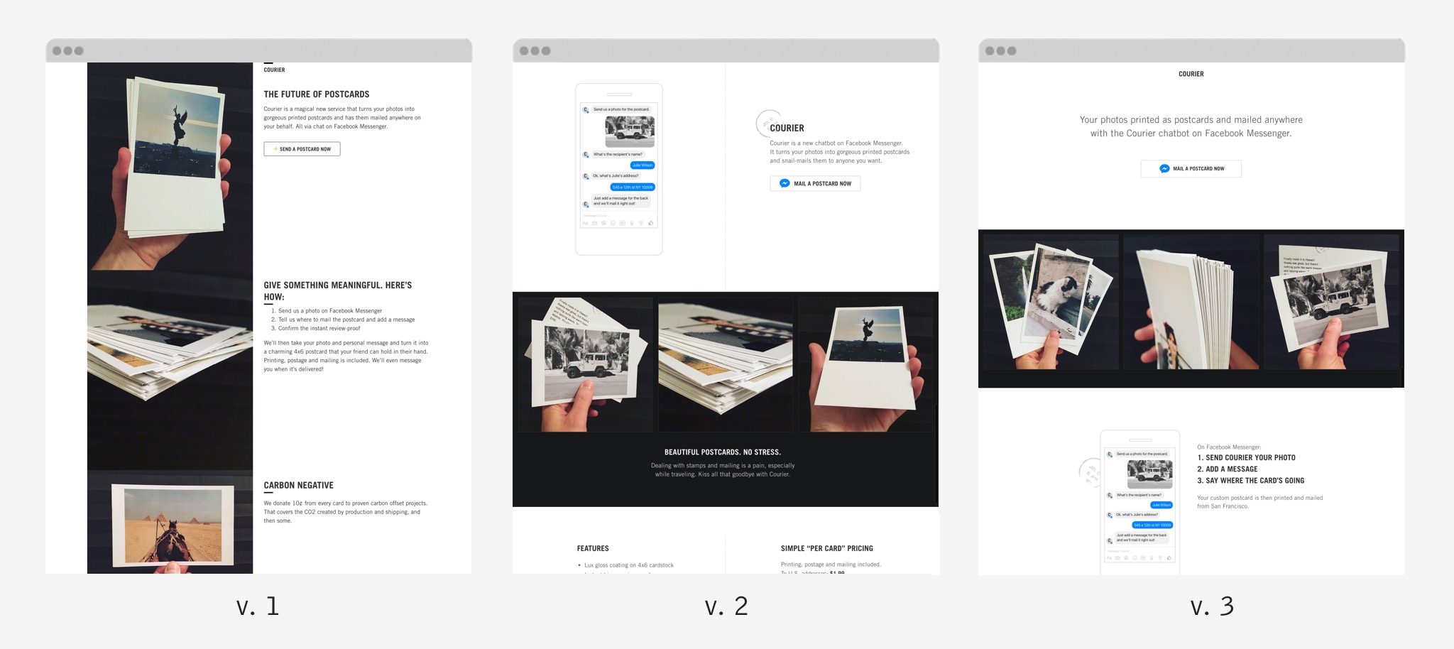
Since bots are new and printed postcards are old, I had a unique challenge in communicating what Courier is and does. I wanted people to understand that Courier is a new way to create printed postcards via chatbot. Two concepts that when combined, created more confusion than I expected. It took three landing page iterations (static comps with ~6 test users per) until I could see they were getting it. I expected some head-scratching, but the first version had people quite confused as to what Courier actually is. Most people didn’t realize they could use their own photos or that it was a chatbot.
Version 2 attempted to address these issues by showing a sample chat screen and speaking more to the “your photos” bit. Test users understood this version better. However, the physical postcard thing was still not coming across the way I expected.
After version 2, I realized that although it was important that people understood Courier was a chatbot, it was subservient to the value prop of mailing custom postcards. I gave the core message prime real estate and moved the bot screen below the fold. The 3rd round of testing showed me people were understanding Courier much better and that it was good enough to build and deploy.
Chat provides a unique way to guide users along a path. Instead of relying on a traditional visual design and copy based approach, you can tell users directly what to do. And the fact that it’s easy to review chat transcripts and look for problem areas, makes iterating upon a chat product easier than any other platform I’ve built on. Confidently addressing UX holes and seeing problems disappear is a great feeling. Sometimes simple copy tweaks were all that was needed, other times I had to reorder certain parts of the flow to handle issues.
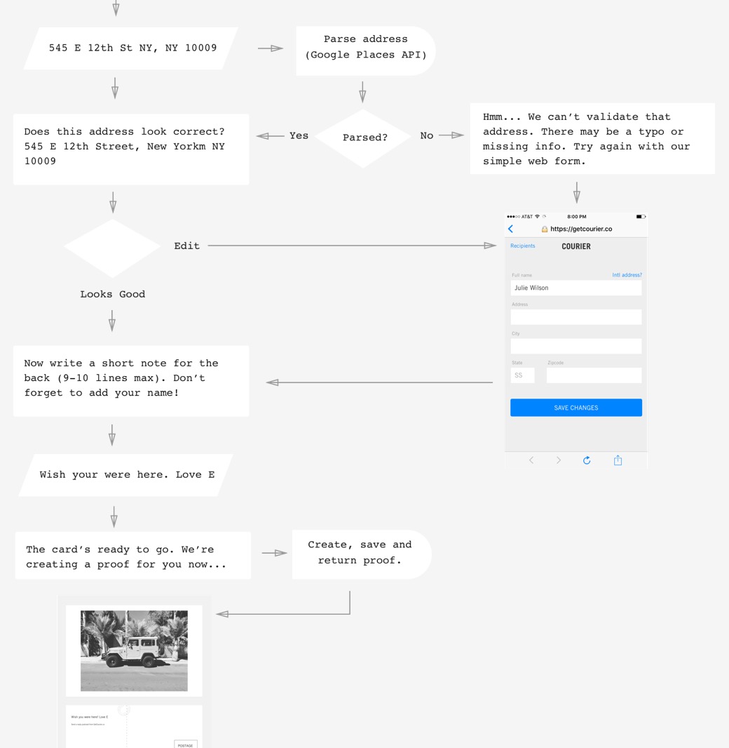
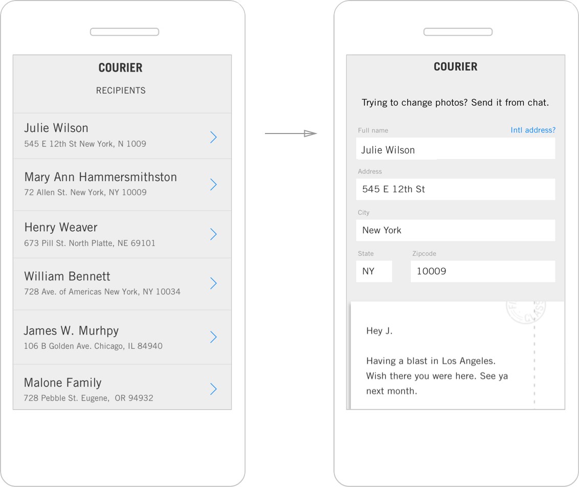
Chat is great in many respects, but it fails when it comes to displaying interactive lists and editing data. This is where Messenger’s web views come in. Deciding when to use them vs staying in chat is an art. Courier handles lists and data editing in web views to great effect by simply prompting users to head back to chat after they’ve saved any changes.
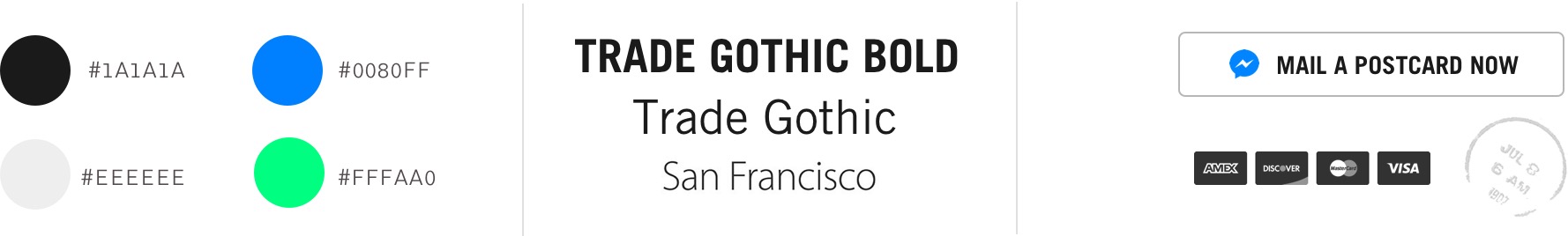
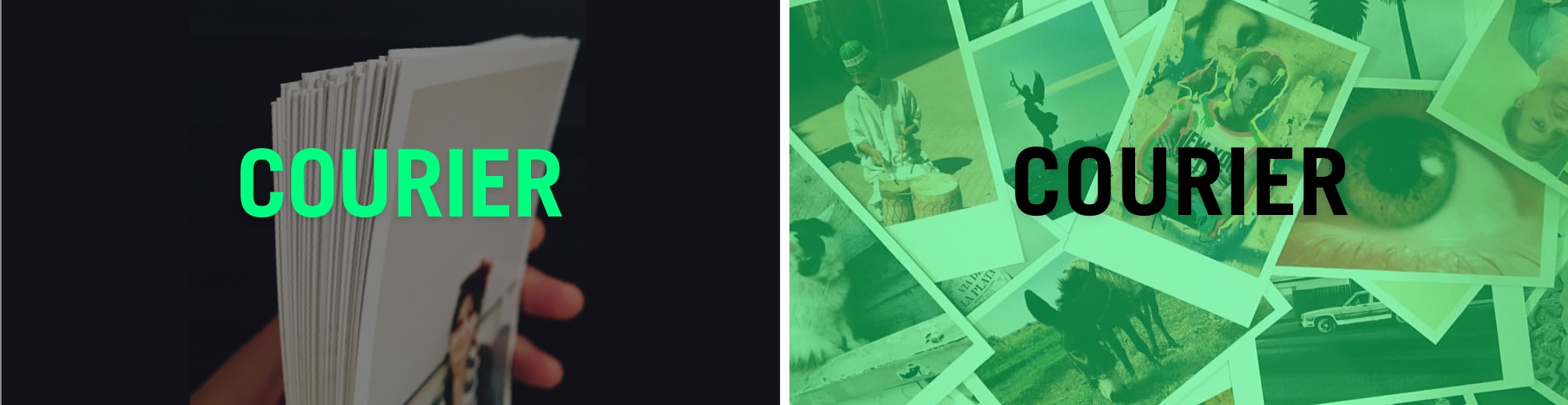
“Cargo Chic” was the phrase that kept coming to mind when developing Courier’s identity. I let this lead my eye and intuition as I created the look and feel of the landing page and brand touchpoints. Trade Gothic (especially set in caps) was a pleasure to work with. Pairing this classic late 1940’s typeface with liberal white space, intimate product shots, and the occasional dash of acid green felt right. The green helps the chat avatar stand out in a user’s busy chat history and the typeface helps anchor the brand to a classic postcard era.